
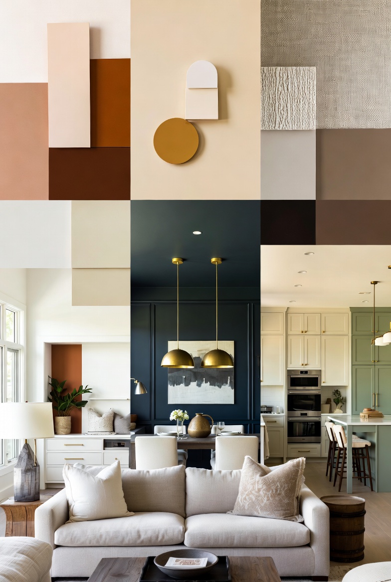
Transform Your Space: 7 Stunning Color Palette Ideas for Home That Designers Love
Ready to transform a home with the perfect color palette? Whether dreaming of a serene organic modern sanctuary or a bold eclectic retreat, the right combination of hues can completely revolutionize any space. The right colors don’t just look beautiful — they change how a room feels, how large it appears, and how enjoyable spending time in it becomes.
This guide explores seven designer-approved color palette ideas that work beautifully in any home. From timeless neutrals to bold accent combinations, inspiration can be found for every room and every style.
1. Warm Neutrals: The Timeless Foundation
Warm neutrals — think greige, soft taupe, and creamy whites — are the backbone of elegant interiors. They create a calm, cohesive base that works with virtually any accent color. Pairing warm white walls with natural wood tones and brass hardware creates a look that never goes out of style.
Best rooms for warm neutrals: Living rooms, bedrooms, hallways
Perfect accent colors: Terracotta, sage green, dusty blue
2. Sage Green + Cream: The Organic Modern Palette
Sage green has dominated interior design for good reason — it’s calming, nature-inspired, and flatters almost every space. Pairing it with warm cream walls, linen textiles, and natural wood creates an organic modern look that feels both fresh and timeless.
Best rooms for sage green: Kitchens, bathrooms, bedrooms
Perfect accent colors: Warm white, terracotta, natural wood
3. Navy + Gold: The Classic Luxe Palette
Deep navy walls paired with gold accents create an instantly sophisticated atmosphere. This palette works especially well in dining rooms and home offices where a bold statement is desired. The key is balance — using navy on one feature wall and letting gold hardware and lighting do the rest.
Best rooms for navy + gold: Dining rooms, home offices, powder rooms
Perfect accent colors: Cream, warm white, cognac leather
4. Terracotta + White: The Mediterranean Palette
Warm terracotta tones bring the warmth of the Mediterranean into any home. Paired with crisp white, this palette feels sun-drenched and inviting. Layering in rattan furniture, handmade ceramics, and woven textiles completes the effect.
Best rooms for terracotta: Living rooms, kitchens, sunrooms
Perfect accent colors: Warm white, olive green, natural linen
5. Charcoal + Warm White: The Modern Contrast Palette
For a dramatic yet sophisticated look, charcoal walls against warm white trim and ceilings create a striking contrast. This palette works beautifully in modern interiors and makes art and furniture pop. Softening the look with plenty of texture — bouclé sofas, wooden shelves, and plush rugs — completes the design.
Best rooms for charcoal: Living rooms, bedrooms, home theaters
Perfect accent colors: Warm white, brass, blush pink
6. Dusty Blue + Soft White: The Serene Palette
Dusty or muted blue creates a serene, spa-like atmosphere that’s perfect for bedrooms and bathrooms. Unlike bright blue, dusty blue is soft enough to feel calming without being cold. Pairing with soft white linens and natural materials creates a restful retreat.
Best rooms for dusty blue: Bedrooms, bathrooms, reading nooks
Perfect accent colors: Soft white, warm wood, light gray
7. Moody Green + Brass: The Jewel Tone Palette
Deep, moody greens like forest green or hunter green paired with brass accents create a jewel-box effect that’s incredibly luxurious. This is a bold choice that pays off beautifully in spaces where drama is desired — think home libraries, dining rooms, or a statement bedroom.
Best rooms for moody green: Dining rooms, libraries, bedrooms
Perfect accent colors: Brass, cognac leather, cream
The 60-30-10 Rule: The Designer’s Secret Weapon
No matter which palette is chosen, following the 60-30-10 rule ensures perfect balance:
- 60% — Dominant color (walls, large furniture)
- 30% — Secondary color (upholstery, curtains, rugs)
- 10% — Accent color (cushions, art, small decor pieces)
This simple formula ensures a palette feels cohesive and intentional rather than overwhelming.
Tips for Choosing the Perfect Palette
- Test before committing: Paint colors should always be sampled on large swatches and observed for 24 hours in different lighting conditions
- Consider natural light: North-facing rooms need warmer tones; south-facing rooms can handle cooler palettes
- Start with what resonates: Pick a piece of art, a rug, or a fabric that speaks to the design vision and build the palette around it
- Don’t forget the ceiling: Painting the ceiling a shade lighter than the walls adds height and polish
Frequently Asked Questions
What are the most versatile neutral colors for home interiors?
The most versatile neutrals include warm greige (gray-beige), soft taupe, and warm white. These shades work in any room and pair beautifully with bolder accent colors as style evolves.
How do I choose the right color palette for a small room?
For small rooms, light reflective colors should be used as the base and the palette should be kept to two or three tones maximum. Bolder colors work better on accessories rather than walls to avoid overwhelming the space.
What colors work best for north-facing rooms?
North-facing rooms benefit from warm colors that counteract cool natural light. Consider golden yellows, warm taupes, or rich terracotta. Cool grays or blues should be avoided as they can make the space feel chilly.
Can I mix warm and cool tones in the same room?
Yes — mixing warm and cool tones adds depth and interest. The key is to let one temperature dominate (about 70%) while the other acts as an accent. For example, warm neutral walls with cool blue-green cushions creates a beautifully balanced space.
The Perfect Palette Awaits
Choosing a color palette is one of the most exciting parts of designing a home. Starting with one room, experimenting with samples, and embracing bold choices can yield remarkable results. The palettes above have been tested by designers across thousands of projects — any one of them can transform a space from ordinary to extraordinary.
Leave a Reply